May 25, 2025
Tempo, Alloy & Grafana: Distributed Tracing in Kubernetes
In this lesson, we'll set up a comprehensive distributed tracing environment using Tempo, Alloy, and Grafana through Kubernetes. We'll examine traces moving through a multi-service e-commerce platform, locate performance issues with Grafana's trace explorer, map service relationships using the Service Graph, and dive into advanced visualizations with Traces Drilldown. I'll share all necessary project files for you to easily follow along with each step of the process.
Become a Cloud and DevOps Engineer
Learn every tool that matters https://rayanslim.com/
Getting Started
Download the project files from the repository: https://github.com/rslim087a/tempo-alloy-grafana-distributed-tracing-kubernetes
Architecture Overview
The stack creates a complete observability pipeline:
Applications → Alloy:4317 (OTLP standard port)
Alloy → Tempo:4317 (forwarded traces)
Tempo → Prometheus:9090 (auto-generated span metrics)
Grafana ↔ Both (unified observability dashboard)
Port 4317 is the OpenTelemetry standard - like port 80 for HTTP, it's the universal port for trace collection.
Deployment Steps
Access & Validation
What is Distributed Tracing?
Distributed tracing is a method for monitoring applications built on a microservices architecture. It helps track a request as it travels across multiple services, providing visibility into how these services interact with each other. In production environments, services are instrumented with code that creates trace data, but for our demo, we're using k6-tracing to simulate requests flowing through multiple microservices.
Viewing Traces in Grafana
From the Grafana homepage (localhost:3000):
Select the Tempo data source
Go to the Explore tab
Make sure "Search" is selected as the query type
Click "Run query"
You should see a list of traces appear similar to this:

Each row represents a complete trace - the entire journey of a request through your distributed system. The "Name" column indicates the specific operation that was performed (like "article-to-cart" or "set-billing"), while the "Service" column consistently shows "shop-backend" as the entry point for all requests.
Each trace shows different durations, giving us immediate insight into which operations take longer to complete. For example, we can see that "article-to-cart" operations take around 500-700ms, while "set-billing" operations vary in performance.
Understanding Spans and Filtering
A span is the fundamental unit of work in a distributed trace. Within a single trace, there are many spans, each representing a distinct operation such as a database query, an API call, or a function execution. Every operation that takes time is captured as a span.
The first span in a trace is called the initiating span (or root span), which represents the workflow being triggered. In our examples, these are operations like "delete-billing" or "article-to-cart" that begin at the "shop-backend" service.
In Grafana's Tempo interface, you can filter traces by selecting specific span names from the dropdown menu:

The dropdown reveals the variety of operations happening in our system:
Database operations: "query-articles," "select-articles"
Service operations: "get-article," "list-articles"
State modification operations: "update-stock," "delete-billing"
User-facing operations: "checkout," "fetch-articles"
When you select a span name as a filter, you'll see only the traces where that operation was initiated from the entry point. As shown below, filtering for "delete-billing" displays multiple instances with varying durations (531ms to 789ms), all originating from the shop-backend service:

This filtering capability lets you isolate specific workflows and compare their performance across different instances. By analyzing these variations, you can identify inconsistencies, spot patterns, and pinpoint potential bottlenecks in specific parts of your distributed system.
Analyzing a Trace
Click on any of the traces to view its detailed diagram:
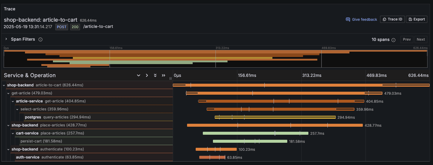
This trace visualization reveals the complete journey of a single request through our system. Each span is represented as a horizontal bar, with the width indicating duration. The spans are arranged hierarchically to show parent-child relationships between operations.
In this example:
The operation "article-to-cart" is initiated from the "shop-backend" service (the root span), with a total duration of 626.44ms.
This operation breaks down into three parallel operations (child spans):
"get-article" (479.03ms) - Communicates with the article-service
"place-articles" (428.77ms) - Interacts with the cart-service
"authenticate" (100.23ms) - Verifies credentials through the auth-service
Looking deeper, we can see that:
The "get-article" operation includes a database query to PostgreSQL taking 294.94ms, representing nearly half of the total trace time
The "place-articles" operation involves a "persist-cart" span taking 181.58ms
The "authenticate" operation is relatively quick at just 63.85ms
This visualization immediately highlights that our database operations are the most time-consuming parts of this workflow. This insight is invaluable for performance optimization - we might want to focus on optimizing our PostgreSQL queries or adding caching to improve the overall response time.
The cascading horizontal bars make it easy to visualize the sequence and timing of operations, clearly showing which processes run in parallel and which are sequential. With distributed tracing, you can quickly pinpoint which service or component is causing delays, whether there are unnecessary sequential operations that could be parallelized, or if specific services are experiencing intermittent issues.
Exploring the Service Graph
Another powerful feature of the Tempo and Grafana integration is the Service Graph, which provides a visual representation of how services in your distributed system interact with each other.
To access the Service Graph:
Click on the "Service Graph" tab in the query type selection
Wait for the graph to render
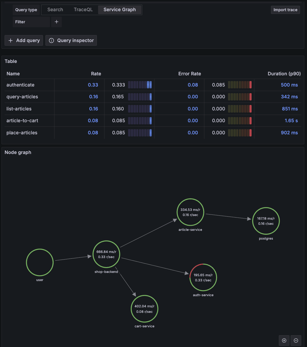
The Service Graph offers a network visualization that shows:
Services as nodes: Each circle represents a microservice in your system
Request flows as arrows: Directed edges indicate how requests flow between services
Performance metrics: Each node displays crucial metrics about the service
Looking at our example graph:
The user entry point connects to the shop-backend service (666.84 ms/request, 0.33 requests/sec), which then distributes requests to three downstream services:
article-service (334.53 ms/r, 0.16 r/sec) - This service communicates with the PostgreSQL database (167.18 ms/r), showing the classic web-database pattern
auth-service (195.65 ms/r, 0.33 r/sec) - Handling user authentication with relatively fast response times
cart-service (402.04 ms/r, 0.08 r/sec) - Managing shopping cart operations
The table above the graph provides additional metrics:
Rate: How frequently each operation is called
Error Rate: The percentage of failed operations (we can see a small error rate of 0.08 for authentication)
Duration (p90): The 90th percentile response time for each operation
This visualization reveals your microservices topology and dependencies while highlighting potential bottlenecks - in this case, the PostgreSQL database with the highest individual service time. The green circles give an immediate indication of service health. Engineers find the Service Graph particularly valuable when identifying critical paths, discovering unexpected dependencies, and planning which services to scale first. When used alongside trace analysis, you get both a high-level architectural overview and the ability to investigate specific performance issues in detail.
Advanced Analysis with Traces Drilldown
For even more powerful analysis capabilities, Grafana offers the Traces Drilldown plugin, which provides an opinionated but highly effective way to analyze trace data. Access this by navigating to:
Understanding Span Rate and Histograms
When entering the Traces Drilldown view, make sure "All spans" is selected at the top rather than "Root spans." The All spans view provides visibility into every operation within your traces, which is crucial for finding bottlenecks that might be hidden when only looking at initiating operations.
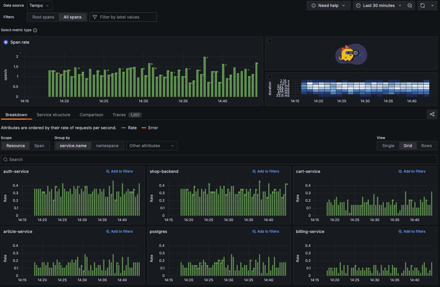
The main chart shows the rate at which spans are being processed across your services over time, giving you a clear view of your system's activity patterns. Notice how the span rate remains fairly consistent with occasional spikes, indicating periods of higher load.
Below this, you'll see a breakdown of the span rate per service. This immediately reveals which services are handling the most traffic - in our case, both the shop-backend and auth-service are processing a higher rate of spans than services like cart-service and billing-service.
Analyzing Duration Patterns
Switch the metric type to "Histogram by duration" to visualize how long your traces are taking:
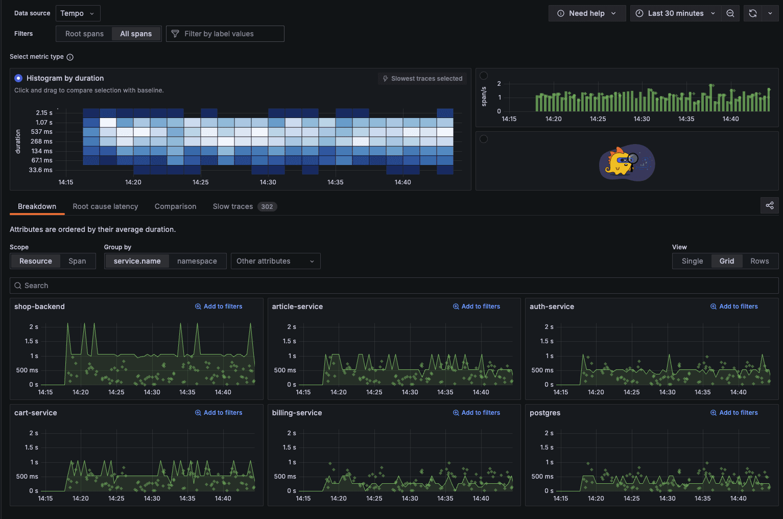
This heat map visualization is particularly powerful - each cell represents traces grouped by time (x-axis) and duration (y-axis), with color intensity indicating the concentration of traces. Darker blue areas show where most traces fall duration-wise.
You can immediately see that most traces complete within the 33.6ms to 268ms range (lighter blue), while fewer traces take longer than 1 second (darker blue at the top). This visualization helps identify outliers and general performance trends at a glance.
The service-specific duration charts below show the variance in response times across different services. Note how shop-backend occasionally spikes to over 2 seconds, while most services maintain more consistent response patterns.
Investigating Slow Traces
Click on the "Slow traces" tab to focus on performance problems:
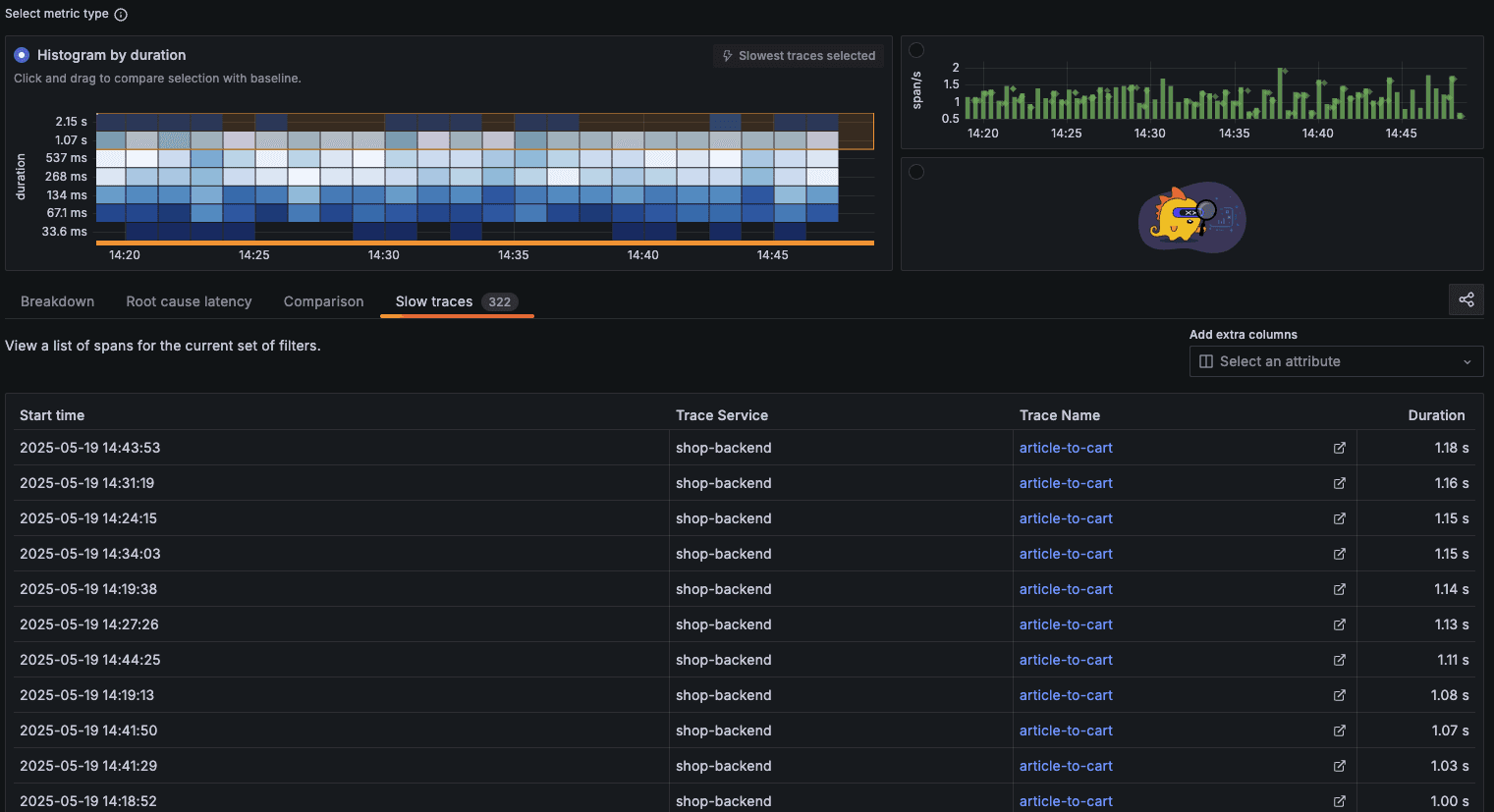
This view lists your slowest traces in descending order of duration. Notice that all the slow traces shown are for the "article-to-cart" operation, with durations ranging from 1.00s to 1.18s. This immediately highlights a potential area for optimization.
For deeper analysis, select the "Root cause latency" tab:
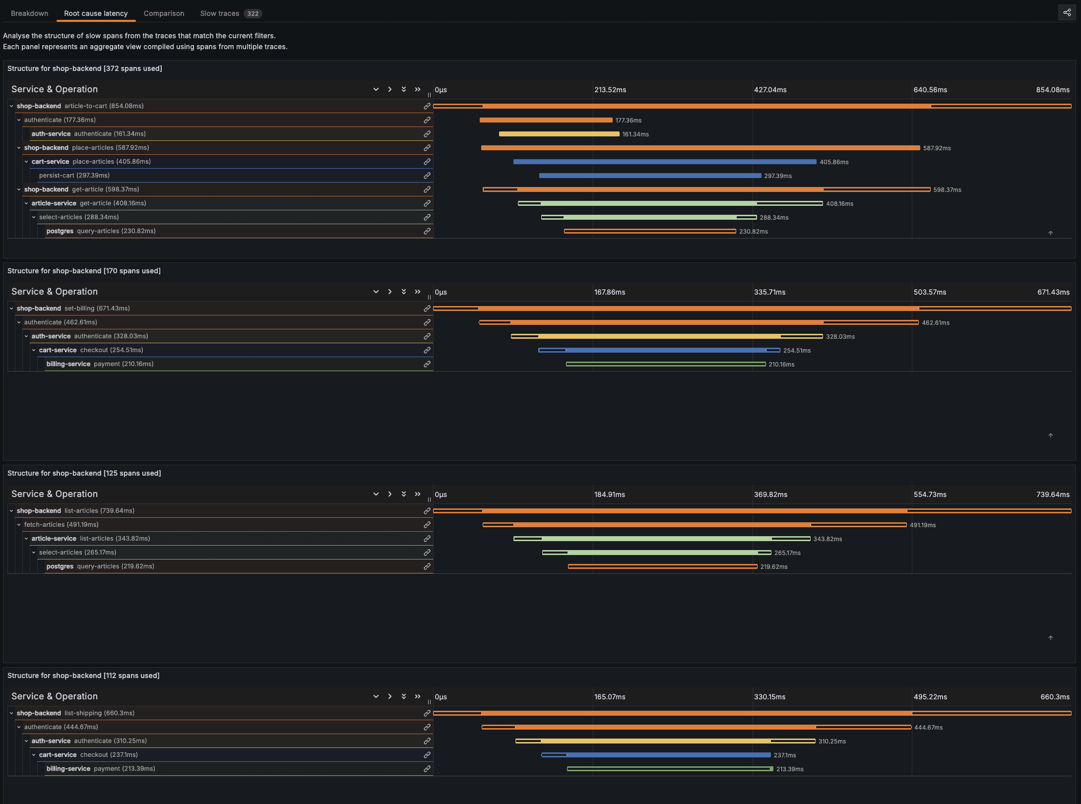
This powerful visualization aggregates spans from multiple traces to show exactly where time is being spent across your services. The breakdown reveals:
For "article-to-cart" operations (854.08ms average):
The database operations in PostgreSQL (230.82ms) account for a significant portion of the time
The get-article operation (398.37ms) is another major contributor
The persist-cart operation (297.38ms) also adds considerable latency
For "set-billing" operations (671.43ms average):
Authentication (462.87ms) is the primary bottleneck
Additional time is spent in checkout and payment processing
By examining these visualizations, it becomes clear that database operations and authentication are the primary performance bottlenecks across most operations. With this insight, your optimization efforts could focus on improving PostgreSQL query performance, adding caching for article data, or optimizing the authentication flow that affects multiple operations.
The Traces Drilldown provides these insights in a much more accessible way than manually examining individual traces, making it an invaluable tool for ongoing performance monitoring and troubleshooting in distributed systems.
Become a Cloud and DevOps Engineer
Learn every tool that matters https://rayanslim.com/